Art quilting, tips, techniques, thoughts and creativity. Textiles, antique quilts, fabric dyeing, fibers.
Saturday, September 29, 2018
Dyeing Play Day
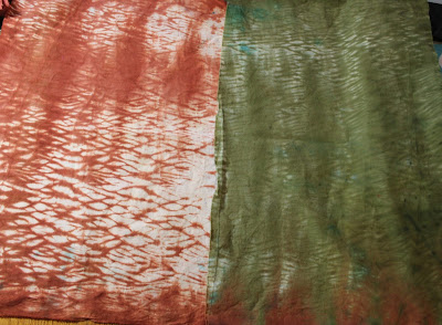
Our Fyber Café group had another fabric dyeing play day at Meredith's in Grants Pass last week. We had great weather and smoke free skies. I did some more shibori and helped others learn how. The first piece is done with Procion MX Terra Cotta dye, the 2nd is Bronze. we love the bronze, it mixes well with other colors and sometimes the colors separate so we really did not know what color it really was. This is the first piece I have only used Bronze. These three pieces were done with turquoise, electric blue and indigo. The photo really doesn't do the colors justice.Bronze and electric blue, I really like this piece.I did 3 pieces by accordion folding them, then ice dyeing them with combos of terra cotta, fire engine red, rose brown, and fuchsia. They are folded in half so you see only a part of the fabric.As soon as I got home from that I packed for a 3 day camping trip to the Oregon coast. It was so beautifulIt was glorious weather, great tide pools, campfire and friends. I am linking this with Nina-Marie's "Off the Wall Friday" click here to see what other talented textile artists are doing.
Friday, September 14, 2018
Thermo Fax Silk Screening
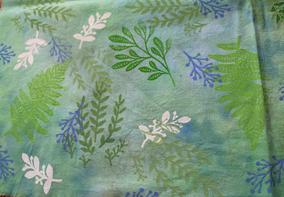
Using some thermo-fax screens I got from Judy Coates Perez at Craft Napa, I made some small samples. I will be doing a hands on demo for our Fyber Café group, so I wanted to make some samples to take to Show & Tell. I used muslin and some hand dyed turquoise fabric for the ferns and leaves. The small teasel prints were made just to use up some brown paint I had mixed up. Then I moved on to printing some fat quarters of my hand dyed fabric. The teasel is printed with two shades of raspberry Speedball printing paint, the contrast was higher when the paint was wet. The smaller piece with the blue print was done on my wipe up cloth from the previous post. I have two teasel screens, one has a larger single stalk, the other has a pair of smaller ones. I'm thinking of using these two with some darker indigo fabrics I have dyed to make a composition. The second fat quarter started with the darker green leaves, then the light green ferns. I added the small white, blue and pale green leaves to fill in the design. The blue paint was supposed to be more of a blue/green color, but I like the contrast. The beautiful caramel fabric was made with lemon yellow and antique gold dyes, maybe a little terra cotta too. The rose screen was from a discount shelf at Walmart years ago, it is very delicate with fine lines, it is also self adhesive, which I really liked. I kept scraping the paint off the edge of the screen onto the fabric. That is why the bees were added, to cover up some of the oops. I think I will add duct tape to the edges of the screen to add a wider border. I really like how this came out, and I made it my screen saver on my laptop. The wood grain was done to use up the brown paint I had mixed up to do the bees. Again a Walmart screen, the fine lines screened really well. Three swipes with the paint gave it a floor board look, as opposed to a single piece of wood. This has been a lot of fun, now I need to figure out how to use the fabric. I am linking this to Nina-Marie's "Off the Wall Friday" click here check out what other talented textile artists are doing this week.
Friday, September 7, 2018
Parfait Dyeing
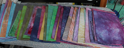
I finally got a chance to play with dyes in my new "Wet Studio." I had made up a dozen bottles of Procion MX dye concentrates for a play day for our fiber art group. I wanted to use up some of the leftovers dyes before they lost their oomph. The last batch of dyes I had done this summer with old dyes, and I got some very pretty pastels. They were good to add to the stash, but not what I was looking for. I even over dyed some of them this time. Using 24oz. yogurt containers, I scrunched a piece of fabric, one color dye, a second piece of fabric and a different dye, then a third. This is called parfait dying and in each layer some of the color mixes with the layer below and above it. Some really beautiful blended colors can be made, you just have to be careful not to make mud. Altho I do make mud on purpose sometimes. You can see I made quiet a few fat 1/4s, also a few nice cotton handkerchiefs. I made a variety of greens, from lime squeeze with a touch of yellow, to pretty pale seafoam, and some nice olive colors. One of the wet dark olive colors was gorgeous, but it came out so much lighter. Next time I'll try to get a deeper color.At the summer play day I had made a few shibori pieces on PVC pipes. The most basic thing I learned is a two color piece needs a bigger diameter pipe, the small diameter the dye colors blend together, but with a 6" dia. you can put on two or three colors and they will stay separate.You can see some of the color blending here, the pinks have purple in them, the purple has indigo. These are my favorites, with the patterning of the scrunched fabric and the multi colors.My cleanup cloth is some times the very best. I spilled a lot of fire engine red that day, my hands were red for days.I tried to get some yellow variations with lemon yellow, antique gold and terra cotta. Some very nice caramel colors resulted from it. Now, to find a new project to use my hand dyes on. I try to have at least one project in the works that uses my hand dyes, mostly mixed with a solid black to make the colors POP! I had LOTS of FUN playing in my studio with these. We are having another dye play day at one of our members in Grants Pass at the end of the month, so more fun to come. I am linking this with Nina-Marie's "Off the Wall Friday" click here to check out what other talented artists are doing this week.
Subscribe to:
Comments (Atom)


