Art quilting, tips, techniques, thoughts and creativity. Textiles, antique quilts, fabric dyeing, fibers.
Showing posts with label Tsukineko Inks. Show all posts
Friday, January 8, 2016
Ink on Acrylic
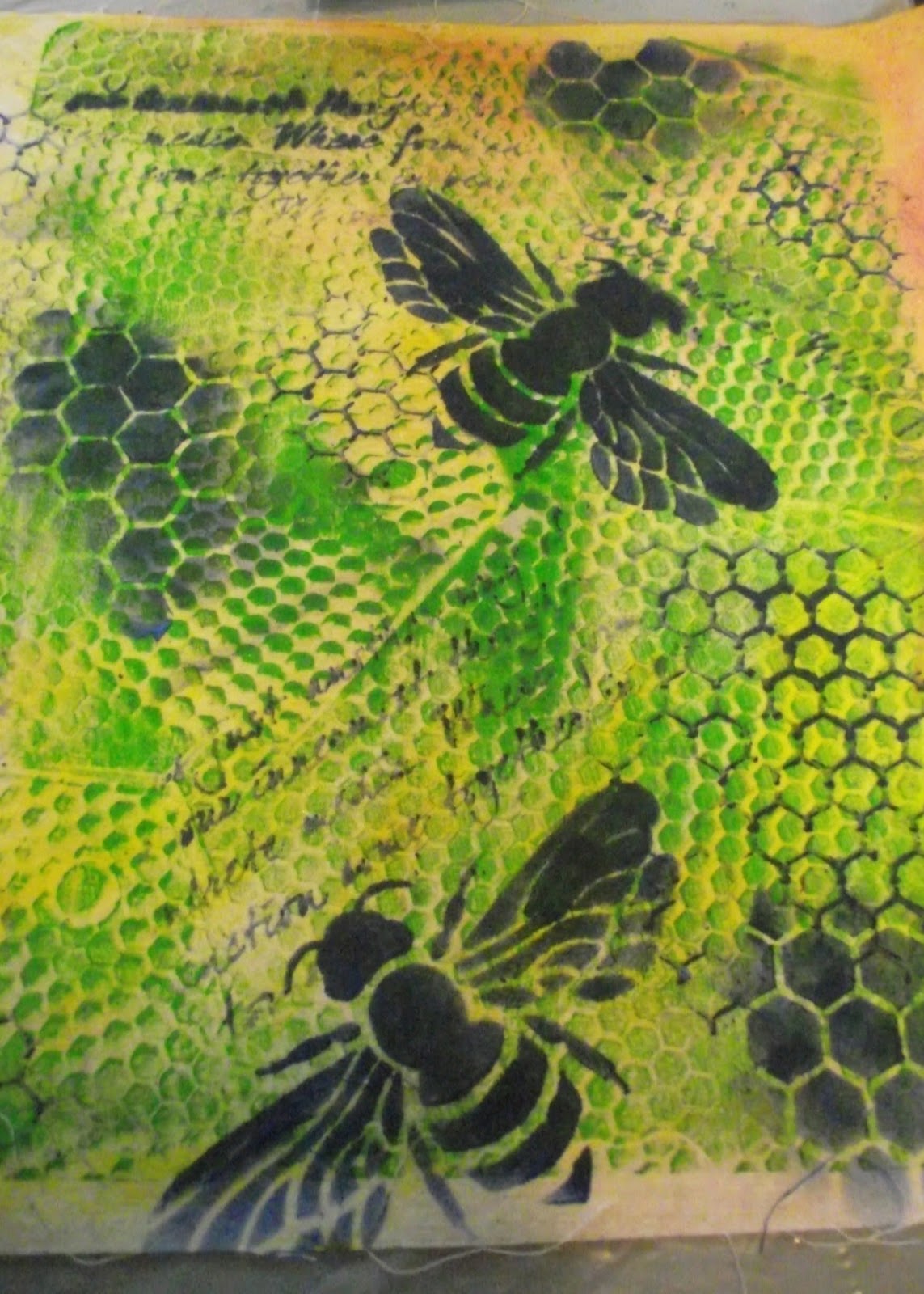
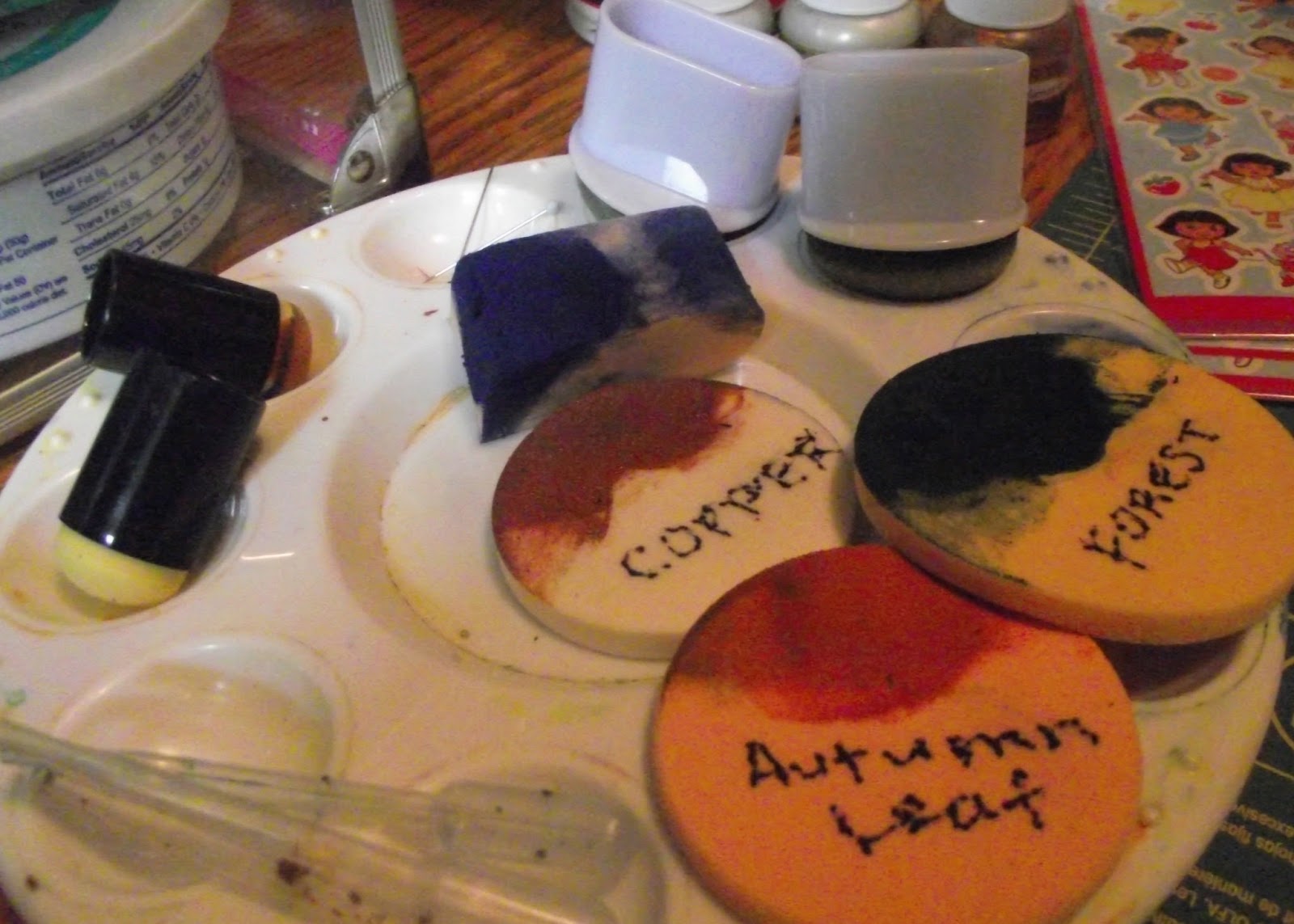
After two work outs with the ink dauber, it showed some signs of wear, so I went and bought two bags of makeup sponges. The left had some fun shapes that might be good for printing as is, stars, circles, etc. The right hand bag was mostly circles of different thicknesses. And what is with the golf ball size purple raindrop??? The daubers are at the top of the photo, still have much more use and they were only $1 each. But I used the sponges with shaving cream and then the ink, they seamed to suck up a lot of ink. But they kept printing softer and softer images, great for layering and depth. I labeled them so I can use them again. The sponge texture is very smooth, but they seamed to wear a bit and get pills, little grains of sponge, that I just brushed away. For $1.20 or $1.50 a bag, they are cheap and disposable. I do like the daubers better though.Since many of my stencils are just great texture, I decided to try adding layers to some gelatin monoprints. When I make prints I usually do 2-3 prints/colors and then add more layers with foam stamps, alphabets, stencils, and other details. So I got some of my gelatin prints that needed work, and tried to add the Tsukineko inks to them. This blah purple print had some masked dragonflies that did not print very well, so I added a stenciled dragonfly on top with blue and copper ink. Not so good, trying to print dark on dark. Next. I started with a lighter print. A green hexagon texture design on a pale yellow fabric. I had used a silicon potholder to print with, I really like the background this made. For contrast I kept with the darker Ultramarine Blue ink, and started with the writing stencil just for some background texture. I realized I did not need more background it was busy enough as is. I have many hexagon stencils in various sizes, but most are negative images, where you paint in the background color, but one is a line stencil of chicken wire in a perfect hexagon pattern. Then I added the large hexagon "holes" in blue and two images of the bee. I like the way this turned out with just two layers, the original green acrylic and the blue ink. Working on this teal print on muslin, I realized the reason the dragonflies did not work, was not because it was dark on dark, but because it was ink on acrylic. The acrylic acts as a resist to the ink. The ink works better when it can absorb into the cotton. The ink is too transparent, that works fine on hand dyed fabrics but on printed acrylic paints, not so good. So I think I will work on layering these gelatin monoprints with stencils and acrylic paints like I was doing before.
Sunday, January 3, 2016
Inked Stencils
My friend could not come over this morning, she has a bit of snow and ice at her house. So since I already had my supplies out, I spent the morning doing more stencils. A practice piece on muslin, with the trilobite stencil, I am getting the hang of it. I got out my box of hand dyed fabric and found just the right dark blue/gray. Inking the trilobytes onto the blue, looks like real fossils in the slate stone they are found in.I am getting nice clear crisp images. I made a piece for myself and a piece for my quilting friend who took geology classes with me in college. I really like ammonites, they are often fossilized in a shiny metallic rock. So I used the metallic copper ink, it went on really well, but needed an extra swipe to get good coverage with the metallic shine. I had to be careful of which direction I swiped this stencil as it has some loose ends that could get caught on the dauber, but mostly it was OK. Next I used a cheaper yellow plastic stencil of leaves. My bright yellow hand dyed fabric was just right. I used "Autumn Leaf" ink. The yellow plastic was nice and sturdy, as I swiped the dauber, none of the loose pieces pulled up. I started to do some faded shadows and partial images to fill up the space more and add depth.I had trouble with the fern stencil. It had lots of loose pieces which kept getting caught on the dauber, making blurry images. I had also washed the dauber, I thought I had dried it enough, but the moisture made the ink bleed. For the larger open spaces I had to keep reapplying the ink, which made a blotchy image too. The stencil also had a good and bad side, the bad side had rough edges that caught at the dauber making it hard to swipe, so pay attention to that when using stencils. But I wanted the ferns mirror images, so I flipped it frequently anyway.This piece of hand dyed has a dark splotch in the center with two lighter areas around it. It was perfect for the willow leaves. I flipped it for the mirror image and added extra length at each side. Now to find something to put inside the frame. I have several bird stencils and found one the right size to use. I used the small dauber, less than 1/2" round, to do the delicate leaves and the small bird parts, it worked well to get the small bits, but it did not hold much ink, and I had to keep re-inking.The grass stencil was an inexpensive one from our trip up to the new Hobby Lobby. The shiny blue plastic was very slick and the dauber went over it smoothly. It was also easy to clean with a tissue. I made ghost images, of faded stalks of grass in the background, and also extra parts in the foreground. I really like how this turned out. The spider web is a Jim Holtz stencil and I was leery of the delicacy, it was also a negative image, so I used a blue for a background on white fabric. I think it came out good, I had to keep re-inking but I got good coverage. It was also nice, because it had NO loose ends, it swiped cleanly. The ginkgo leaves had large open areas and very tiny, thin loose bits. I definitely had to be careful which direction I swiped it, the dauber was still a bit damp, so I got some dark blurry areas. It got better, the more leaves I made. I decided to go over the darker ones with an ink called "Champagne" I thought it was a pale gold metallic, but it was more of a light gold shimmer. It lightened the dark leaves and added a nice highlight. So I spent my morning playing with my inks and hand dyes. I have lots of new stencils I haven't tried yet, a nice delicate dragonfly, a wood grain, and sea shells, and fish skeletons. I could play like this a long time. I also want to try shading two colors on the same stencil, blending the colors. I have so many stencils now, that I need to make a list so I don't buy a duplicate. I also need to try the ink with my own hand cut botanical stencils. Stay tuned to see what I come up with next. Also check the previous post. Comments would be appreciated.
I am linking this with Nina-Marie's "Off the Wall Friday" click here see what other wonderful textile artists have been doing this week.
Saturday, January 2, 2016
Tsukineko Inks
After seeing the gentleman at the AQS Show in Syracuse demonstrate the Tsukineko Inks with a small dauber and stencils, I have wanted to try the inks again. I have used the inks for painting skies, and other things, but never stencils. He made it look so easy, especially fine delicate stencils. I used shaving cream as the medium for the inks, and a painter's dish with small convex cups. A foam core, plastic covered board is my work surface, on the dining room table.First I dipped the foam dauber in the shaving cream, wiped it on the edge of the tray and dipped it in the ink. I was not getting good coverage and had to keep daubing the design. It is tricky getting just the right amount of ink on the dauber. It was too much in some areas, you can see the blotches, the stencil is a distressed pattern so maybe not the best one to start with. I moved on to the black fabric with silver metallic ink. I was still getting blotches and not good coverage with the daubing, so I decided to try swiping it. The lower part of the black fabric came out better, with the swipe technique.I selected another stencil and green ink, and tried the swiping method. It worked better, as long as I did not get caught on the pointy parts of the stencil. Getting the lettering right with the blue ink was trickier. Getting the very small detail on the lettering just right took some practice. My most difficult stencil, it is delicate writing about art. I had tried it with acrylic paint and gave up quickly, it was just too small. The ink worked great, you can still see where I added more ink, but it is getting better. So I carefully daubed in the cream, wiped it on the edge of the tray, and did the same with the ink. Wiping the ink gave me more control over the coverage, and did not give me the blotches every time I started over.My last piece is the best, I also used the foam dauber on the fabric as I cleaned off excess ink. I used one dauber for all the changes in ink color, just daubing it on paper to clean it, no washing in water. I also just wiped the stencil with tissue to clean it up. Tomorrow my friend Peggy is coming over and we are going to play. I want to try it on some hand dyed fabric, I also have a dandelion stencil I want to try, it is very delicate. Of course I am addicted to stencils and have bought a lot more recently. I think as background texture the blotchyness won't matter much, it is delicate, so I can't think it would be good as a main feature. I'll see how it works on chunkier stencils.
I am linking this to Nina-Marie's "Off the Wall Friday" click on the badge in the right hand column to see what other textile artists were up to this week.
Subscribe to:
Posts (Atom)