Wow! I made it to Craft Napa, with a maximum of stress, worry and thinking I may not be able to make it. The weather in Oregon was SNOW, even tho Roseburg rarely gets an inch or two of snow each year. Medford/Ashland south of us got 7-8" that week before I left. When I singed up, my sister said "January?" and I said if the weather was bad, I'd just drive down the coast. So that is what I planned, until California got a HUGE rain storm coming in, gale force winds on the coast and flooding and landslides predicted. Everyone talked me out of the coast route, if there is a landslide, you have to go all the way BACK to get around it. So... with much trepidation, I drove over the Siskiyou pass into Northern Cal. I picked the perfect window of opportunity, Eugene was getting 6 more inches of snow that day, but it was all going north, so I headed south. The rain coming to Calif. was warm, they call it a "Pineapple express" as opposed to the "Arctic Blast" we were getting. So the pass was rainy, warm, but not icy, and it rained and rained and I thought I might need an ark. The news reported Folsom Lake, near Sacramento got 13" of rain in 24 hour! I spent a few days with the in-laws before heading to Napa, but we were still concerned with flooding. I made it fine, to the Wednesday evening registration. I was a little early, so just sat and visited with a nice lady, who was in some of the same classes I was in. Pokey Bolton, the sponsor of the show, presented everyone with gift bags of goodies, name tags and class schedules. We had fun with a drawing, to get your classes free, everyone drew a Ghirardelli Chocolate from the bag and whoever got the gold Caramel wrapper, won. Little did they know I had bought a package of Ghirardelli chocolates, and only had the gold ones left in my pocket, cause they are not my favorites. Ha Ha. I played fair, and a very excited lady won. I then drove to my nephews in St. Helena, about 25 minutes north, and stayed there, for the 3 days. My first day of class, was with Mellanie Testa.


The class was deconstructed/constructed foregrounds and backgrounds. We worked on a 12" x 12" framed board, I could not find one at several art supplies in Seattle, but got one at home in the wood burning section of Michaels for about half price of the art store ones. I started softly with lavender and pink acrylics, and painted thick so we could impress rubber stamps in the paint to create texture. The next layer I used burgundy and we added a thick gel medium to the paint and used stencils to leave a raised design. She liked the high contrast of my board, but it became a problem later. So now the scary part, paint over it with another color, what? Hide all the good stuff I had done? This is why I took this class, I am afraid to add layers, because I already like what I have. But my motto for this trip was "Loosen Up" that is why I was there! So how about the opposite on the color wheel, burgundy and green, so of course I went with LIME green!! I'm not such a chicken as I thought.

I only limed half the board, keeping two small sections of pink to save. After getting it dry with a heat gun, we sanded off the top layer to expose the texture underneath. The lime became not so "in your face" and the raised flowers in the burgundy came through. This is my favorite part of the whole painting, and I saved most of it as we progressed. We covered everything in a layer of clear gel medium, before we broke for lunch, to let it all dry very well. I went down the street to the local grocery store and got a premade salad, as the restaurant prices in Napa were quiet high by my standards of rural Oregon.


Before lunch I snapped a bunch of other artists' work in progress. I also ran to the Art Supply Store in town and got some new stencils. I am a stencil addict!! I admit it. A pink flamingo and palm fronds, 2 palm trees, a coral reef with tropical fish, and I can't remember what else.

After lunch we decided what design we wanted on our boards, Melanie had some photo copies you could choose from, or draw your own. I used one of my bird stencils, with a long branch and added some tropical leaves from another stencil. She asked us to add some stencils for texture patterns and to paint in a darker color around your drawing. The idea is for the drawn design to peak through the paint like a window. This is where I got into trouble with the high contrast, I already had dark colors on the page, and I should have painted the dark background BEFORE stenciling any more. As it was I had to paint around some of the stenciling, arggh. The lighter pink areas of bird, did not show up well enough, so I added some paint, and eventually I got out a black Sharpie to outline. I added more lime teardrop stenciling to the darker blue areas, that helped a lot. So, I learned a lot about layers, mixing color combo's, and design, but I would have done it different, if I knew in advance what she wanted.

The photo is not quiet where I stopped at, but it gives you a good idea of where I'm going. I will have to work on it at home, adding more dark and more stenciled texture. The top right bird needs help too. Here are some more of the students work as they layered. Many of them used the poppy flowers and pods designs, one used a butterfly. There is lots of wonderful work here, I can see I need to blend my colors more, and less contrast to start with. Complimentary colors are fine for the end work but I think you need to use analogues colors at first.


Many of these techniques I can apply to fabric painting, but not the sanding layers. I also see why drying between some layers helps, not to just keep working wet. More student work.


Another thing I tried was to use new Golden Open Fluid acrylics, as opposed to my cheap bottles of craft paint. I painted with each, the craft paints were more opaque and chalky, the open acrylics, were more transparent and heavily pigmented. I'm just not sure I want to pay the price for the better paints. $1.99 vs. $8 and up per bottle. when we broke for lunch the class next door had laid all their screen prints in the atrium on blue tarps to dry. What fun!! I can't wait to try it tomorrow.


 Crystal had a variety of stencils, and the last print is on an "ugly" hand dyed fabric.
 Lorraine loved the feathers, and she made a few prints with an opaque yellow on black.
 Meredith used a lot of botanicals, a tangle of eyelash yarn, and stencils.
 Stephanie's spirographs in many bright colors, she made many more.


 Tracy used feathers and a favorite stencil. The last print is the stencil and it's ghost print on the same page, isn't it fabulous! I made some prints to use as the demonstration, but I did not get any pics, I'm sure some of them will show up in a future project. I will be linking this to Nina Marie's "Off the Wall Friday" click here to see what other fantastic textile artists are doing this week.


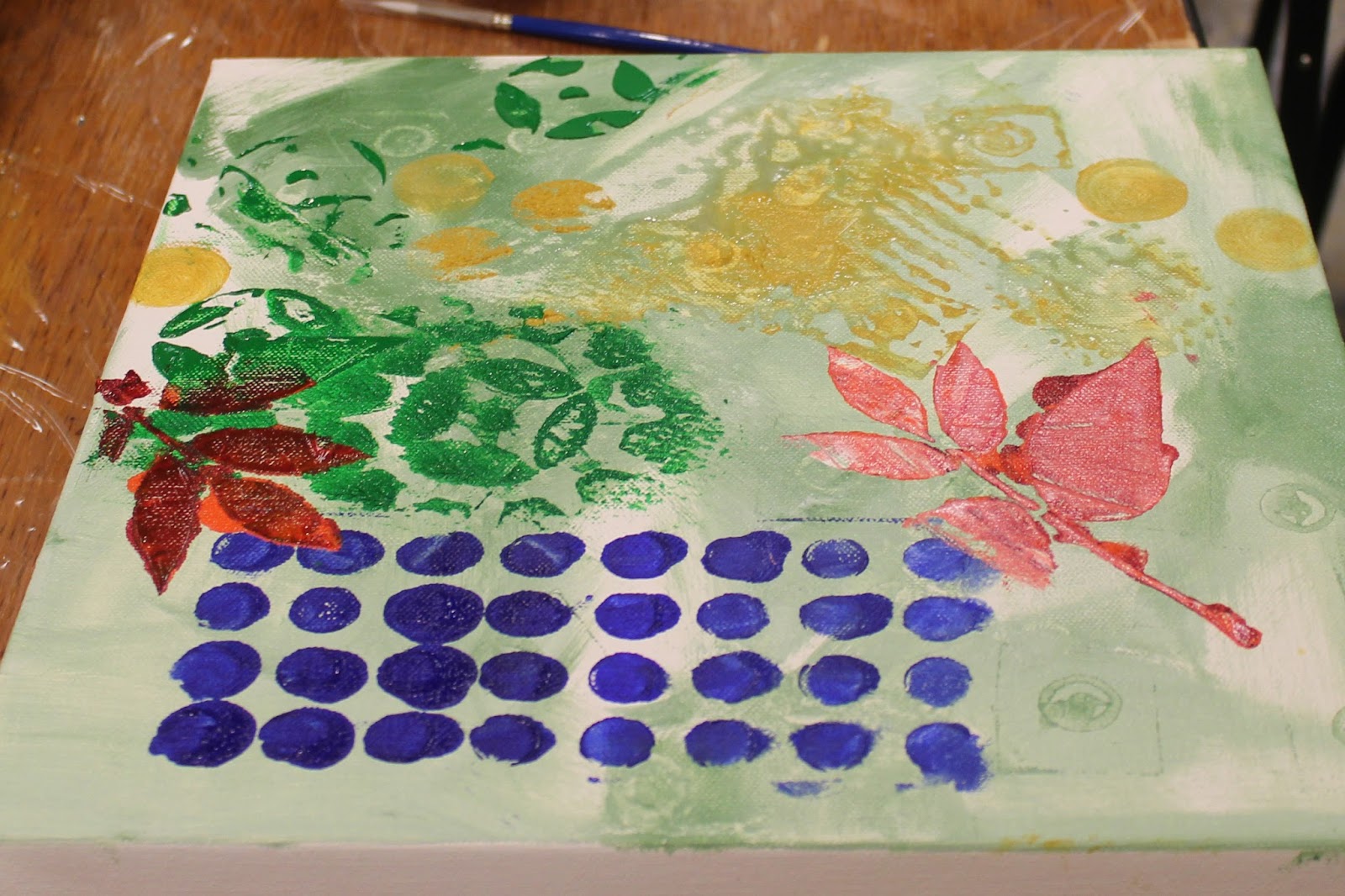


 Before lunch I snapped a bunch of other artists' work in progress. I also ran to the Art Supply Store in town and got some new stencils. I am a stencil addict!! I admit it. A pink flamingo and palm fronds, 2 palm trees, a coral reef with tropical fish, and I can't remember what else.


 Many of these techniques I can apply to fabric painting, but not the sanding layers. I also see why drying between some layers helps, not to just keep working wet. More student work.


 Another thing I tried was to use new Golden Open Fluid acrylics, as opposed to my cheap bottles of craft paint. I painted with each, the craft paints were more opaque and chalky, the open acrylics, were more transparent and heavily pigmented. I'm just not sure I want to pay the price for the better paints. $1.99 vs. $8 and up per bottle. when we broke for lunch the class next door had laid all their screen prints in the atrium on blue tarps to dry. What fun!! I can't wait to try it tomorrow.


