Art quilting, tips, techniques, thoughts and creativity. Textiles, antique quilts, fabric dyeing, fibers.
Showing posts with label Leonardo Da Vinci. Show all posts
Saturday, June 4, 2016
I'm Published
I AM PUBLISHED!! Wow! I could not believe it when a quilting friend told me at JoAnn's that I was in a magazine. The newest AQS magazine, May 2016, has a spread about the International Painters challenge that I was a part of. The 90 quilts have spent a year in Japan and a year in France. Now that they have reached the US the AQS wanted them to display at all 6 of their national shows this year. We had already given permission for photography and advertising for the display, so they just put it in the magazine. My quilt picture is on the first page, lower right, the one I did on Leonardo da Vinci. You can see my blog about it here and here.
Saturday, December 12, 2015
International Painters Exhibit
Friday night, I got off work, rushed into the bathroom at the drivers lounge, changed into a nice blouse and did my makeup. I picked up Clare and Pat W. and we raced up to Eugene, Or. in the pouring rain. The Emerald Art Gallery in Springfield was exhibiting our International Painters Challenge. They were having their 2nd Friday Art Walk & Artists Reception, the place was packed. My munchies that I brought, chocolate trail mix clusters were gone in under two minutes.The challenge had 30 U.S. artists, 30 from France and 30 from Japan. One person from each country was assigned an artist, for a total of 90 quilted wall hangings, 19" square. They were displayed as a set, an artist with an artwork from each country, on a black fabric background. It was really interesting to see how each textile artist interpreted the painter. Mine is the top Leonardo da Vinci piece, you can see how I made it here and here. Mucha by American artist and curator Linda Steller, she coordinated the U.S. artists, and has arranged for the entire collection to be exhibited at all the American Quilt Society shows in 2016. So it may come to your area, please go see it. Cezanne was interpreted by Sylvia, from our Fyber Cafe group. It has pieces of hand dyed silk, that she dyed with this project in mind. Many of the pieces had 3-D elements, as this Degas artwork by a French textile artist. Beads and sequins added extra sparkle to this art work, by a Japanese artist. All of the Klimpt pieces were richly done with gold metallic fabrics and lots of beading. I especially liked the way the face was painted/transferred. The French version of Leonardo da Vinci's Last Supper.
Monet's water garden was done in hand dyed fabrics, strip pieced by the U.S. artist and 3-D silk waterlilies, with organza flowers from France. I really liked the beautiful color on this Georgia O'Keeffe flower and the detailed thread work, from the U.S. Renoir's flower girls were wonderfully collaged from floral fabrics. Tokaido's trees in the fog, was the most similar of two works by the same artist. All the others were completely different as the textile artists interpreted each painter from a different point of view, the 3 Klimt's & Mucha's were also the most similar style wise. Warhol's style in different colors ways, was great, it reminded me of my Golden retriever. The thread painting was well done and unique to each section. The layers of tulle and other shears gave this Wyeth painting the beautifully blended contours of the woman. I was impressed with the technical aspect of how this was achieved. There were many more wonderful art works, but I can only show you a few that caught my attention the most. The gallery was a wonderful place and I thank them for the excellent job they did to display everything. A bunch of us from the Roseburg area then went out to dinner at the Plank House Pub, and I got fresh steelhead with mushroom Marsala and roasted hazelnuts, it was fabulous. It was also interesting to see the "big" city atmosphere of a collage town, with the variety of people all conversing loudly, and enjoying a late Friday night out. Roseburg as a small town, tends to shut down early. I hope you enjoyed this glimpse in the World Painters Challenge, please see it if it comes to your area.
I am linking this to Nina-Marie's "Off the Wall Friday" click on the badge in the right hand column to see what other talented textile artists are doing this week.
Monet's water garden was done in hand dyed fabrics, strip pieced by the U.S. artist and 3-D silk waterlilies, with organza flowers from France. I really liked the beautiful color on this Georgia O'Keeffe flower and the detailed thread work, from the U.S. Renoir's flower girls were wonderfully collaged from floral fabrics. Tokaido's trees in the fog, was the most similar of two works by the same artist. All the others were completely different as the textile artists interpreted each painter from a different point of view, the 3 Klimt's & Mucha's were also the most similar style wise. Warhol's style in different colors ways, was great, it reminded me of my Golden retriever. The thread painting was well done and unique to each section. The layers of tulle and other shears gave this Wyeth painting the beautifully blended contours of the woman. I was impressed with the technical aspect of how this was achieved. There were many more wonderful art works, but I can only show you a few that caught my attention the most. The gallery was a wonderful place and I thank them for the excellent job they did to display everything. A bunch of us from the Roseburg area then went out to dinner at the Plank House Pub, and I got fresh steelhead with mushroom Marsala and roasted hazelnuts, it was fabulous. It was also interesting to see the "big" city atmosphere of a collage town, with the variety of people all conversing loudly, and enjoying a late Friday night out. Roseburg as a small town, tends to shut down early. I hope you enjoyed this glimpse in the World Painters Challenge, please see it if it comes to your area. I am linking this to Nina-Marie's "Off the Wall Friday" click on the badge in the right hand column to see what other talented textile artists are doing this week.
Saturday, September 28, 2013
Leonardo Continued
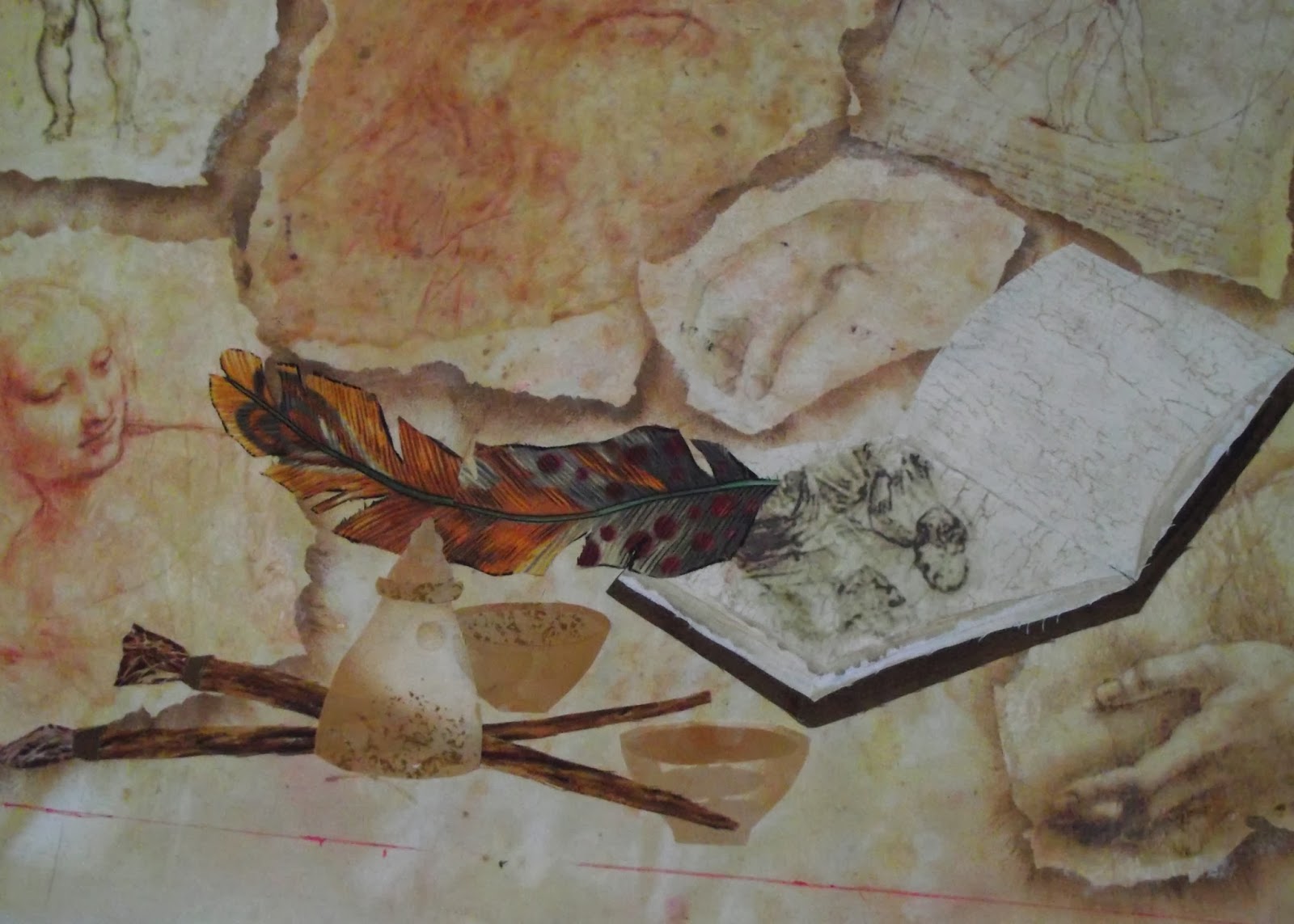
I am making progress on my Leonardo Da Vinci quilt. The main photo of Leo has been placed in the center with mat medium over the printed tissue paper. I was worried about getting enough glue over the large area, or getting a big wrinkle in the tissue, but it worked smoothly. All though the image sketch lines were very vague, I was able to see them enough to quilt them. I cautiously started to free motion quilt, I had a good selection of threads, but it did not matter much, which color I used. The background print colors were more important. As I stitched I decided to do a minimum of stitching, and not "thread paint" as I had intended. The fine delicate lines were too hard to follow, and I did not want to hide all Leo's delicate shading. Outlining the edges of the individual pages in cream thread, helped them pop off the background, even more then the painted shadows. The applique pieces at the bottom right, a sketchbook, feather pen, paint brushes and small pots, will add interest and details to a rather monochromatic design. It feels good to make such quick progress on this deadline piece. I had thought about it a long time before I began, and I think that planning made it go so smoothly, that it wasn't a panic situation. My usage of different techniques when I needed them, on an original design, was a confirmation of all the technique lessons I had worked on in the past. It gave me a wide range of options to choose from when I needed them. It's great when it all comes together!
Thursday, September 19, 2013
Da Vinci Challenge Begun
This years International Quilt Challenge, that I belong to, has chosen International Painters as their theme. I was assigned Leonardo Da Vinci, as my artist to interpret into an art quilt. An artist from France and one from Japan will each also do Da Vinci. There are 30 artists each from the US, France and Japan, there will be an artist from each country do each painter, so there will be 3 different interpretations. The first show they will be in, is Quilt Week Yokohama, then the even BIGGER International show in Tokyo. From there they will go to France, then the USA for several years. I have participated twice before, in "Currency Exchange" and "International Festivals", both toured Japan, the USA, and one show went to New Zealand, the other to France. I'd like to thank the curators for giving me this chance to participate. I began by selecting several images from his sketches, of a pair of hands, the statue of David, a Madonna, Vitruvian Man and sketches from the Last Supper, also his self portrait, which would be the main image in my composition. I arranged them onto a hand painted piece of muslin, that I did in acrylic paint, with splatters, and salt, in a light terra cotta color wash. Seeing them laid out, my brain storm was to shadow paint the torn images, creating a raised relief effect. I used two shades of reddish brown, and dry brushed around each piece of paper, leaving a crisp edge and a shading shadow. See first two photos. Next photos, as I began to paint around the bottom two pictures, and the paper templates, completely painted around. It gave the contrast in color that I needed to highlight the pictures, so it wasn't too blah. You can see the softly mottled background fabric, and the crisp shaded outline of each paper template. The next part of the project was to print my images onto tissue paper for image transfer to the fabric. I used plain white tissue paper for stuffing gift bags, I ironed it on low, and taped it to a piece of paper from the computer printer. I used Adobe Photoshop to crop the images, and give them a little more contrast. Then I ran each sheet individually through the printer, they went pretty well with just a little extra ink at the top edge. I tore each image to fit into the painted template area, and spread mat medium with an index card, in a thin layer onto the fabric, placed the image and burnished it down with the edge of a clean piece of card. Then added more drops of mat medium, and spread it evenly over the image, being gentle not to tear the paper or smear too much ink. Some of the reddishness of the ink bled off, but did not disfigure the image. Some small wrinkles developed, but I left most of that in to give it an "Old" texture. The images transfered beautifully, it looks like burnished leather on an old stucco wall. They have a slight satin finish, but it is smooth and flexible, and should be easy to stitch through. The game plan is to finish applying all the images, and then applique a sketchbook, ink jar, and feather pen on the bottom blank area. I will then thread paint/quilt, over the lines of the images, especially the self portrait, to try to highlight his lines and the sketchy quality of his work. I am very happy with my progress, it is coming out even better than I had hoped. I have never had a piece where the quilting did not add a wonderful quality to the finished piece, but I am worried about this one. I don't want to ruin the lines of his drawings, and I'm not sure how the texture will change the look of it. We can only wait and see. Stay tuned.
Subscribe to:
Posts (Atom)