Art quilting, tips, techniques, thoughts and creativity. Textiles, antique quilts, fabric dyeing, fibers.
Showing posts with label Patterns from Photos. Show all posts
Friday, May 13, 2016
"Forks in the Road"
The Fyber Cafe textile arts group has a challenge this year, the theme is "The Path Less Traveled." I got my idea for my piece when I was out with my sister for lunch in Snohomish, Washington. As we were getting back in the car there was a fork leaning against the curb, ha ha ha, I stopped and took a photo if it. So I went to the Salvation Army thrift store and bought an assortment of forks, serving forks, wooden, plastic, different colors. I grabbed some of my own silverware and my camera and went to a newly paved and striped parking lot. I scattered the forks on the yellow and white lines, I made patterns, crossed them, and staggered them. When I went home I took a couple of pictures with the manhole covers in my street.I printed the photos on fabric, with my computer printer. I make my own fabric sheets, treating the fabric with Bubble Jet Set, trimming to size, and ironing freezer paper on the back. I thought the black and yellow was too stark, and I could not get a really rich black to print on the fabric, so I changed the yellow stripes to different colors. I cut the photos up and arranged them on a muslin backing, and collaged them, overlapping and filling the space. The outline is wavy because it has to match the other artist's pieces like a jigsaw puzzle, and the path is continuous through all twelve pieces. I free motion machine quilted, in matching rayon threads, mostly to outline each item. This photo is before the binding, I used a very narrow 1/8" bias binding. I also printed up some road signs I already had in my photo collection, and some words in different fonts, to show life changing moments where we might take a different path. It was fun coming up with different words, and I did not use all the ones I printed. I have always wanted to use my photos this way, and am glad I got the chance to do this technique. The complete display of "The Path Less Traveled" by members of Fyber Cafe, at the Umpqua Valley Quilters' Show, at the Douglas County Fairgrounds, in Roseburg, Oregon.
Saturday, January 16, 2016
Chicken Wire Auditions
The final two chickens are done, yea! I like the zebra stripe fabric in the black and white chicken's tail. I hope they have some personality, but they are in the background, so are smaller. I still need to finish the eyes, maybe that will give them some spark. I found a chicken wire print when I was in the Seattle Area, they had a cream color and a blue color background. I got both, but the blue was too intense, a paler sky blue would have been better. So I went with the cream color, but it was a lot of plain background. Deciding to add a wood print fence rails worked out, but it took some auditioning. The first strips I cut were too dark, so I switched to a lighter print. I wasn't sure about the line going through her face. I tried angling in the end pieces, it led the eye to the face, but then I thought the top edge of the grass should match the angle. The final choice is two rails on the fence. With the boarder on, it is now ready for quilting!
I am linking this to Nina-Marie's "Off the Wall Friday" check it to see what other talented textile artists are doing. click here
Tuesday, December 22, 2015
Creating Chickens
To start creating chickens I first had to find my "Feather" fabric. This was challenging due to the fact that it was all mixed up with my landscape fabrics, trees, leafs, rock texture, tiger fur, coral reef fabrics, a huge collection of fabric I had collected to make my scenes from my photos. I started sorting into cardboard photo boxes from Michael's. Yea! they were on sale. I pulled out all the fur, tigers, zebra, leopard, snake skin textures and put them in a box and labeled it. I am very organized, most stuff is boxed and labeled, but it doesn't do you any good to make a box if you have no where to put it. My shelves are full, could it go back where the fabric was, of coarse not, that was overflowing. Next the feathers, not as much as I thought, and some of it was blue, orange and green, not really going to work, except maybe for a parrot. Scale is also important, most of it was too big to make my chickens. I made two chickens, using textural fabrics, not much of the feather fabric. I think they will look great with stitching/thread painting. I am waiting on the others, until I decide what the background will be, that will influence the chickens, either I make them a dark value or a light value, so that they stand out and don't blend in. Next is the search for chicken wire fabric, I just knew I had some. But this occasioned a sort through and clean up of the next area of my sewing room. A big stash of fabric with "objects" on it. Birds, Easter eggs, alligators, cats, John Deere tractors, marbles, dinosaurs, elk, salmon, butterflies and dragonflies, etc... etc... It went on and on, more sorting, more boxes, decisions to get rid of the stuff for children's quilts. Cut up the children's prints and use them for charity baby quits. I spent two days, cleaning and sorting fabric, but the chickens only took 2 hours to make. And I never did find any chicken wire fabric. So a trip to Joann's Fabrics, and the Quilt shop downtown, no luck, but I did get a white fabric with 1" hexagons on it. I can dye it or paint it, add fence posts, and when I stitch it, I can add a wire texture, so I am brain storming this option. I'm gonna brave the Christmas shoppers and go to WalMart tomorrow to get prescriptions, so I'll check there for the fabric too.
Friday, December 4, 2015
She Flies With Her Own Wings
"She Flies With Her Own Wings" is the challenge theme for our Fyber Cafe textile arts group. It is the Oregon State Motto. My cousin's granddaughter loves her pet chickens, and I thought she would want to fly with them if she could. So I asked her mother to take a few photos of her with her hands out to the side, sitting on the lawn. I'm going to put feathers in her hands and chickens in the background. I enlarged the photo and traced it onto clear plastic to make a pattern. In Photoshop I printed it in poster mode to get a 2 x 2 sheet for a pattern. With cropping, it comes out to 18" x 24" when I add extra width for the feathers. I worked on the flesh tones first, I have an assortment of 8 x 10 fabric gradations, in pink to beige to tan brown hand dyes. I picked them up at a quilt show just to do faces with. I've added a few pieces of Kona cotton and others to give me a wider range. Next I want to try dyeing my own fabrics for this purpose, I love to do portraits. I used a clear plastic outline of the face to get the positioning just right. With this type of pattern I use the fusible instead of raw edge applique, because I need exact shapes. Wonder Under fusible interfacing gives me sharp outlines with little raveling. Working on the blouse and skirt next, I followed the colors in the photo. The left side shadow will be changed, that fabric has too much contrast. Making the skirt I used some vintage fabric hexagons, so I folded the one edge and overlapped it with the first piece of fabric, to look like folds in the skirt. Instead of looking like my fabric pieces were too small. I hope the black lace gives the folded skirt more dimension too. I had enough to put along the bottom edge also. A 1/8" pink satin ribbon will be embroidered at the gather point of the blouse and tiny buttons added. The grass is beginning to come together. I have collected landscape prints for quiet some time, so I had a variety of grasses in several sizes to give depth to the picture. I still need to find some cute chicken pictures to make a pattern from, to put in the background. I had two fabrics, a gray and black colorway of feathers, I cut them out and made them shorter and narrower, and I also want to get some real feathers to embellish with. Thread painting will help the fabric ones look more real. So I am making progress, the deadline was November, but it really just needs to be ready for the Guild quilt show in April. Hopefully I'll have more to show you next Friday.
I am linking this to Nina-Marie's "Off the Wall Friday" to click on the badge in the right hand column and see what other wonderful textile artists are doing this week.
Saturday, November 29, 2014
Monarch Finished
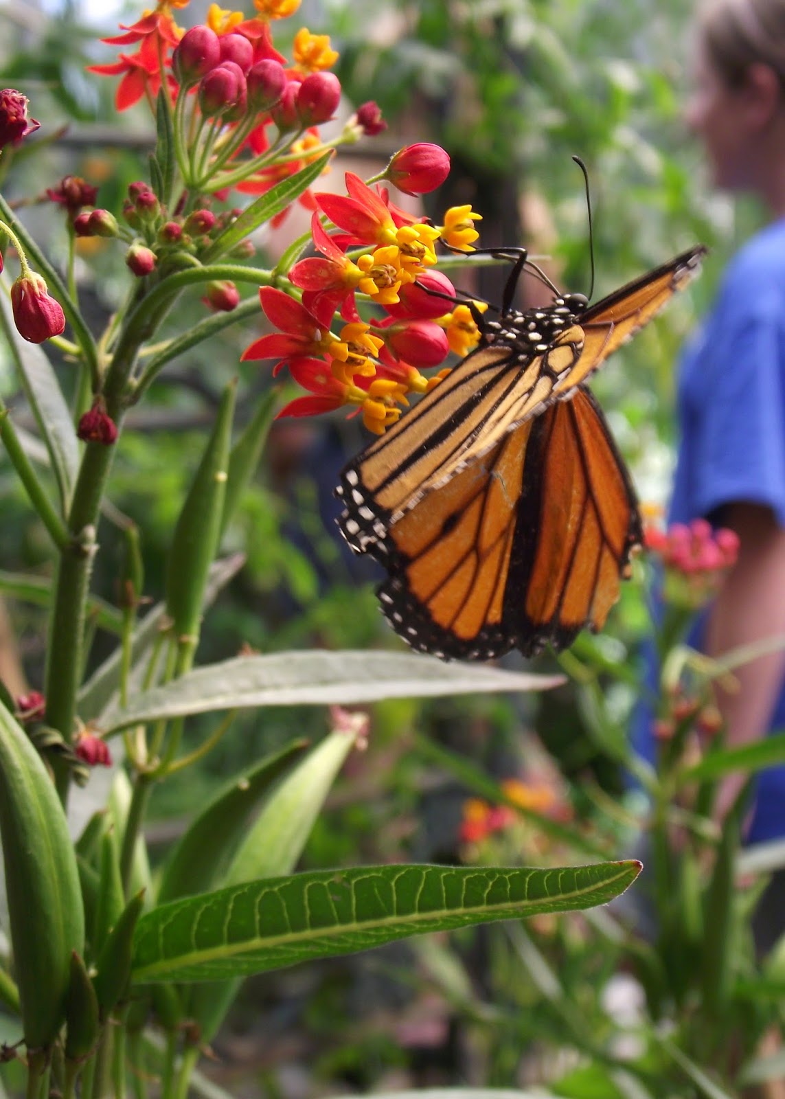
The Monarch is finished, this photo shows the background color better. The orange of the wings is veined, and the flower detail is better with the stitching. I like the simplicity of the Monarch design, not too much to distract you from the main object.
Wednesday, November 26, 2014
Monarch of the Glen
For several years now, I have been trying to use my photographs for quilt patterns. When I got the new Fuji digital camera, I was really jazzed about it, I took loads of pictures. These butterflies were at the Elkton, Oregon, Butterfly Gardens, part of the Elkton Community Education Center. They have an enclosure where they breed butterflies and raise the cocoons, It is heaven for photographing, but they still flit away as soon as I get the focus adjusted on my camera. For my pattern, I took the plant material from one photo and the butterfly from another.This is the full photo, as I traced it, but I thought it was too much blank space and not enough butterfly. So I cropped it horizontally, and focused on the butterfly. I did add a few more leaves, as most had gotten cropped out of the bottom of the pic. I like the strong diagonal lines, and the balance of the butterfly hanging off the bottom of the branch. I began with some of my hand dyed sky fabrics, I choose the lighter, almost turquoise fabric for the background. It sort of washed out in the photos, but it is a clear blue. Since I don't dye many orange fabrics, I was worried I wouldn't have the right orange, but I did. All the other fabrics are my hand dyed ones, except the black and the body. I had to simplify the flower shapes, 'cause they were too jumbled up. I could not tell if they were red or yellow flowers. I finally decided they were red petals, and the yellow part was the center of the flower, that popped up when it bloomed.I used "Wonder Under" fusible web, to trace my pattern pieces and fuse to the fabric, and raw edge applique to hold it all down. When you have very specific shapes, the fusible is the best way to transfer patterns and get every thing to fit back together. I am a little bored with it now, after doing the ram and the butterfly. It is like paint by numbers, once the fabrics are picked out it goes together with out much creativity. Thread painting helps the creative process, but this one was simple and boring. I enjoyed the doing the ram more, because the fabric choices were more important.
Most of the time I use muslin on the back with an off white bobbin thread, but I decided to use matching colors in the bobbin. The background area, I used a "teardrop" pattern of free motion quilting. The name of the wall hanging came from a TV series, from the BBC, called "Monarch of the Glen" the monarch on the show is the Laird of a Highlands Scottish Castle, trying to make the castle pay it's way, in this modern day and age. My husband and I have been thoroughly enjoying it, as TV watching is about all he can do. So we make popcorn and watch 1 or 2 episodes every night. I am almost done with the binding, then I'll post the finished pic.
I'll post this on Nina-Marie's "Off the Wall Friday," click on the badge on the right hand column to see what other VERY talented artists have been doing in textiles.
Most of the time I use muslin on the back with an off white bobbin thread, but I decided to use matching colors in the bobbin. The background area, I used a "teardrop" pattern of free motion quilting. The name of the wall hanging came from a TV series, from the BBC, called "Monarch of the Glen" the monarch on the show is the Laird of a Highlands Scottish Castle, trying to make the castle pay it's way, in this modern day and age. My husband and I have been thoroughly enjoying it, as TV watching is about all he can do. So we make popcorn and watch 1 or 2 episodes every night. I am almost done with the binding, then I'll post the finished pic.
I'll post this on Nina-Marie's "Off the Wall Friday," click on the badge on the right hand column to see what other VERY talented artists have been doing in textiles.
Saturday, November 1, 2014
"Ram"
I'm still working on the binding, but the "Ram" is finished. I thread painted his horns first, lots of wonderful cracks and texture, then double stuffed them with two layers of poly batting. Dense free motion quilting in the background and fleece, made the horn curl really stand out. I love how it is so dimensional. I use rayon threads to quilt, I like the shine and the stitching really adds a lot to the overall appearance. Quilting contours on the face and spirals in the fleece helped blend all the shades of fabric I used. I lightened up the eye area with a lighter thread color, and highlighted some of the face too. The dark area under the top of the horn is his ear, the area below the horn tip is shadow. Does that come across at all? The blue sky is an ice dyed piece of fabric that I made this summer. It is quilted in looser spirals, similar to the fleece area. I wish the photos really showed how much the horn stands out.
I am linking this to Nina-Marie's "Off the Wall Friday" click on the badge in the right hand column to see what other talented textile artists are doing.
Thursday, December 26, 2013
Waiting for Parade, Ready to Quilt
The little girls waiting for the parade, is ready to quilt. I have spent the last three days on it, working on the background and finishing the details. It was a lot more work then I thought it would be. Working in shades of gray for the sidewalk, asphalt and bridge railing, was a challenge. One good point was I did have the many shades of gray that it took, and also a variety of textures. The benefits of having a large stash of fabric. Choosing the sky fabric was difficult, I spent several hours trying to decide. I had two different hand dyed blues, one lighter and brighter, one more blue and darker. After taking digital photos, comparing them side by side in Photoshop, then converting the pic to black and white to check the value, I finally decided on the darker one. My main reasoning was that it was supposed to be raining, not too bright, I wanted the sky to recede, not jump out at you. I don't usually have such trouble picking a fabric, but they were both very nice choices. My husband couldn't even decide for me, ha ha. In the end I covered most of the blue anyway with foliage. The polka dots on the umbrella are kind of over whelming, but that was what drew me to take the photo of the girls in the first place. I used some extra colored pencil after the photo was taken to darken the underside of the umbrella with more orange, hoping it would tone down some of the dots. I think it did help.
Compare the original sketch with the finished quilt top. I'll post the original photo again when I get it all quilted, tho you can find it in older posts. Next step, lots of thread painting! It will add a lot of texture to the sidewalk, asphalt, foliage, and architectural detail to the bridge. The thread really makes it all come alive, and blends the different elements together. Since I am off work for the next week too, (I drive school bus - Christmas Break) I am hoping to get it all done, before I go back to work.
I am going to link this with Nina-Marie's "Off the Wall Friday" click on the badge in the right hand column to see some other wonderful quilt artists.
Compare the original sketch with the finished quilt top. I'll post the original photo again when I get it all quilted, tho you can find it in older posts. Next step, lots of thread painting! It will add a lot of texture to the sidewalk, asphalt, foliage, and architectural detail to the bridge. The thread really makes it all come alive, and blends the different elements together. Since I am off work for the next week too, (I drive school bus - Christmas Break) I am hoping to get it all done, before I go back to work.
I am going to link this with Nina-Marie's "Off the Wall Friday" click on the badge in the right hand column to see some other wonderful quilt artists.
Sunday, December 8, 2013
Pink Jacket Girl
I got the fabric selections and pieces done for the pink jacket girl. I am mostly happy with her. I mistakenly made the bag yellow and not the skirt, so I had to come up with another color for the skirt, or remake the bag. I choose this shade of green, to be closer in value to the dark jeans, the yellow would have been pretty bright. The softer yellow of the bag, adds continuity and balance, with the yellow umbrella, with out fighting for attention. The green is also the complimentary color to the pink, on "The Wheel."In these two pictures, you can see how the surrounding colors influence the fabric on the face. The teal on the umbrella girl makes her beige face look gray. While the fuchsia on the jacket makes the other girls shadow side of the face look purple. I hope this is only obvious because of the camera/monitor, and not in real life. Now to do the background, lots of shades of gray for the sidewalk and concrete bridge in the background. Fall leaves and some blue sky will spark that up a bit. I'm linking this to Nina-Marie's "Off the Wall Friday" click on the link in the right hand column and see other amazing Quilt artists.
Sunday, November 24, 2013
Umbrella Girl
The Umbrella Girl is taking shape, the denim jeans were the easiest part, I had the perfect fabric. Finding the teal was difficult, as the teals kept going bluer or greener, I did not want something too bright to fight with the umbrella, and I thought it was also in the shade of the umbrella. The face fabric was from a packet of hand dyed flesh tones that I picked up at a quilt show. It still does not give me the range of color I want for shadows, in this small a format. It is either too pink, or too grayed beige. Maybe I'll have to try to dye my own at the next dye workshop. I went more red with the hair, so it would contrast with the yellow umbrella. Too yellow a blonde would not have stood out. I ended up fusing the pieces, because they are still small, rather than raw edge applique. I wanted to have clear details and not have frayed edges around the face and hands. It is ok if a tree or rabbit gets a little frayed in a landscape, but not a person.An "a ha moment" when looking at the photo, gave me a lighter yellow at the top of the umbrella, where the sun bounces off of it. I used an orange colored pencil to shade the underside of the umbrella for more contrast. When the ribs are highlighted it will give more shape and definition to the umbrella, and adding the pink and fuchsia dots will add a lot of pizazz. I am linking this to Nina-Marie's Off the Wall Friday, click on the badge on the right hand column to see some other wonderful quilt artists.
Saturday, November 9, 2013
Begining "Waiting for the Parade"
This is the inspiration for my next art quilt. I took the photo at last year's Veterans Day Parade, the girls were leaning out waiting for people to throw candy. One of the books I read on quilting people, is that it is not who you know, nieces, nephews, friends, but the body language and the story it tells. So I have tried to apply that theory to my pictorial quilts. I think the girls are cute, and posed well, the contrast in colors between the yellow umbrella and the pink, really pack a punch.This is the first sketch I made, with clear plastic, I cut up sheet protectors, and used an ultra fine Sharpie pen. I trace the main lines, then the finer detail, and try to simplify the background. They are standing at the curb, with an arched cement bridge rail in background, I eliminated the older girl, and put them closer together. Next I tried to add more background detail, made notes about contrast and colors, and then decided to crop it. Making the girls more of a close up focus. With a double line crop, I made the umbrella overlap the border, giving them more motion and emphasizing the leaning forward in the frame. I will make the border part of the picture, with those sections being a darker shadowy color for contrast. THE FINAL SKETCH--- I got rid of most of the background, making the girls the focal point, it has more POW! The polka dots on the umbrella will add a lot of depth and shape. The next step is to posterize this in Photoshop, blowing it up onto four pieces of paper, will make it about 16" x 20. I may go bigger to 24" x 30". The decision will be based how how small the smallest pieces are, do I need them bigger to make them easier to handle? Which size will give me the best view and ease of construction. This will be a raw edge applique project, now it is sort of like a jigsaw puzzle, cutting out pieces and fitting them together. I am not a wishy washy person when it comes to picking fabric, I go with my gut instinct. I don't hem and haw about my fabric choices, I make a choice, go with it, and if it doesn't fit later, I'll change it. I keep in mind value and contrast, whether a piece is behind or in front of another piece, creating depth. Studying color theory can give you a headache, but it is a very good basis for your decisions, then when it is time to apply color theory I use my intuition. Now it is time to PLAY WITH FABRIC!!!
Subscribe to:
Posts (Atom)